Color Trends in Amsterdam Homes: Warm Ochres, Clay Reds, North Sea Greens
Amsterdam light is soft, low, and endlessly shifting—especially in late afternoon when rooms glow. This year’s color trends lean into that mood: sun-warmed hues, tactile finishes, grounded woods, and calm contrasts. Think ochre and clay rather than neon, North Sea greens over primary blues, and subtle off-blacks replacing stark white/black pairings. In other words, color as a material—quiet, confident, and made to live with.
The Amsterdam Color Narrative: Warmth, Tactility, Calm
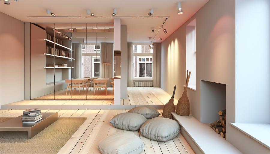
After years of cool greys and gallery white, homeowners here are rediscovering warmth. The goal isn’t maximalist saturation; it’s depth. Matte, mineral surfaces catch the golden hour without glare. Natural woods and stone sit comfortably beside soft, broken hues. If you own a canal house, a jaren 30 apartment, or a compact nieuwbouw in Noord-Holland, these tones work with the light you have rather than fighting it.
The 2026 Palette: What’s Landing in Homes Now
Sun-baked neutrals: Oat, sand, mushroom greige with a red or yellow undertone. They make north-facing rooms feel less chilly and pair well with oak, birch, and travertine.
Ochre and saffron accents: Not bright school-bus yellow—more “saffron tea” and “wheatfield.” Great for entry niches, shelving backs, and media walls where evening light pools.
Clay and terracotta: Muted rusts and iron oxides add grounded warmth to kitchens and stairwells. Use as a full room color or as a half-height band to anchor tall spaces.
North Sea greens and blue-greys: From lichen and sage to deep pine. These bring calm to bedrooms and studies without turning somber.
Soft black and espresso: Swap pure black for off-black with brown or green undertones. Perfect on doors, radiators, and window trims for definition without harsh contrast.
Chalky off-whites: Ivory, chalk, and bone with a touch of warmth. They bounce light in narrow halls and play nicely with historic plaster and beamwork.
Finishes That Make Color Feel Expensive (On a Realistic Budget)
Limewash and clay paint: These mineral-rich finishes produce subtle movement that feels handcrafted. They’re breathable—useful for older masonry and canal houses that need walls to “exhale.”
Mineral silicate paints: Extremely durable and vapor-permeable; ideal where condensation can occur. They bond with mineral substrates, aging beautifully.
Timber that runs warm: Oiled oak, ash, and walnut are back. A natural oil finish deepens color and reads luxurious under evening light. Consider herringbone in mature homes and wide planks in nieuwbouw.
Stone with character: Travertine, Belgian bluestone, Jura limestone—each plays well with the clay/ochre family. Honed rather than polished to avoid glare.
Matte metals: Aged brass, bronzed steel, and patinated nickel soften the transition between warm walls and cooler architectural lines.
Local Realities: Monumentenzorg, VvE, and Narrow Staircases
If your home is a protected monument in Amsterdam, exterior colors visible from the street (window frames, shutters, doors) are tightly regulated by Monumentenzorg. Interiors are typically more flexible, but historic plaster and soft brick call for breathable paints (limewash, mineral, or high-quality clay) to prevent trapped moisture and salt blooms. Always document existing conditions and confirm with the municipality when in doubt. See the city’s guidance at amsterdam.nl.
For apartments with a VvE (homeowners’ association), any color visible from common areas or the façade—front doors, balcony undersides, hallway walls—usually needs VvE approval. We prepare clear sample boards and RAL/NCS references so the VvE can sign off quickly and avoid last-minute delays. Pro tip: include sheen level; a “RAL” alone won’t guarantee the same look across brands and finishes.
Logistics matter too. Those charming, narrow staircases? They complicate painting and drying. Choose low-odor, water-based lacquers for stair treads and balustrades so the staircase can be reopened the same day. In tall canal houses where stack effects intensify fumes, plan phased works and mechanical ventilation.
Finally, many Amsterdam homes sit on pile foundations; micro-movements are normal. Use flexible fillers and paints with a bit of elasticity on hairline-prone corners, especially along stairwells and beam interfaces.
Room-by-Room Strategies for Typical Noord-Holland Homes
Canal houses: Light often drops off at the back. Use warm whites (ivory/chalk) at the front rooms; deepen to clay or sage as you move inward. Consider painting ceilings and walls in one color in narrow corridors; it simplifies lines and makes them feel intentional, not cramped. Gloss on trims (10–20% sheen) adds a heritage note without glare.
Jaren 30 apartments: Work with the existing character—stained glass, brick fireplaces, and panel doors love olive, lichen, and ochre. A clay-red chimney breast paired with off-black radiators reads classic, not trendy. Keep skirting and architraves slightly lighter or darker than walls for gentle definition.
Nieuwbouw (IJburg, Houthavens): White boxes benefit from texture and gentle contrast. A full limewashed wall in warm bone, oak shelving, and a soft-black window reveal will warm the space without eating light. Use North Sea blue-greys in bedrooms to quiet the palette.
Lighting, Health, and Sustainability Notes
Color is only as good as the light that hits it. Pair warm palettes with LEDs at 2700–3000K, high CRI (95+) for accurate color, and dimming for evening wind-down. In kitchens and studies, add focused 3000–3500K task lighting so ochres and clays don’t skew too warm for work.
Choose low-VOC, water-based paints with EU Ecolabel or equivalent declarations. Mineral and lime-based paints reduce off-gassing and suit older substrates. Refinishing existing joinery—painting cabinets in off-black or deep green, for instance—often beats replacement from both a budget and footprint perspective.
Planning energy upgrades? The ISDE subsidy for heat pumps or solar boilers (rvo.nl/isde) changes indoor comfort and daylight dynamics. Better glazing can cool color temperatures; test swatches again after window upgrades to avoid surprises.
A 6-Step Amsterdam-Proof Color Plan
- Map your light: Note orientation and times you use each room. Choose warmer neutrals for north/east spaces; greens/blues for restful south/west rooms.
- Pick a core trio: One warm neutral, one character color (ochre/clay/green), and one dark for definition (soft black/espresso). Everything else supports these.
- Decide sheen by function: Matte for walls, eggshell/satin for trims and doors, hardwearing water-based lacquer for stairs and kitchens.
- Test large swatches: Paint A3 boards and move them around for 48 hours—morning, midday, golden hour, and after dark under your actual LEDs.
- Align with rules: If Monumentenzorg or a VvE applies, collect references (NCS/RAL, sheen, brand) and submit early to avoid delays.
- Phase the works: Start with high-impact zones (entry, living back wall) and circulation (stairwell). Keep a touch-up kit labeled with batch numbers for future maintenance.
Amsterdam rewards considered color. When tones are warm and finishes breathe, rooms feel settled—especially when the low sun pours in. If you want help translating this palette to your specific plan, we’re here to prototype finishes, prepare VvE packs, and schedule tidy, low-disruption works that fit real city life.