Color Trends in Amsterdam Homes: Golden‑Hour Neutrals, Mineral Greens, North Sea Blues
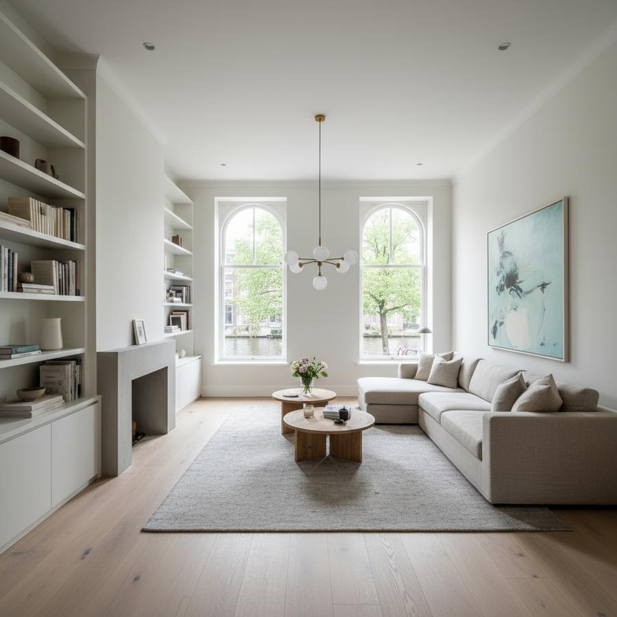
Color Trends aren’t about repainting every season; they’re about choosing tones that feel good at breakfast in February and still make sense during a July heatwave. For Amsterdam and Noord-Holland homes, the most interesting movement in 2026 is toward golden-hour warmth—sun-baked neutrals, mineral greens, and deep, seaworthy blues—applied with tactile finishes that make compact rooms feel calm and composed.
Why Color Trends Matter in Amsterdam Light
Our latitude softens daylight and stretches the blue hours. Many canal houses and 1930s apartments have deep floorplates, north-facing rooms, and narrow windows with historic glass. In winter, cool light can make stark whites look flat; in summer, the low evening sun brings a beautiful honeyed cast. The winning approach this year: lean into warmth that still reads refined.
Before you pick paint, calibrate your lighting. Choose LEDs with CRI 90+ and 2700K dim-to-warm (down to ~2000K for evenings). If you’re replacing glazing, ask your supplier for a neutral low-E coating to avoid green or violet color shifts on your walls. Small choices like these keep your colors honest.
The 2026 Palette: Golden-Hour Neutrals + Mineral Accents
Golden-hour neutrals: think oat, barley, and light camel that carry warmth without turning orange. Limewash and clay paints in these tones give subtle movement that suits historic plaster and modern drywall alike. They’re forgiving in tight stair halls and make low-ceiling rooms feel taller.
Mineral greens: muted olive, sage, and lichen bring a grounded calm. They pair with oiled oak and blackened steel, and they’re excellent on joinery—wardrobes, radiator covers, and kitchen islands—where color needs durability.
North Sea blues: inky, salt-sprayed blues with gray undertones for bedrooms, studies, or the back of a bookcase. These accents work best in matte or eggshell; high gloss can read harsh in our soft light.
Quiet clays and ochres: for dining corners and entryways. A compressed stairwell painted in a mid-ochre can feel sunlit even on cloudy days. If you’re nervous, start with the inside of a door or a single paneled wall rather than a whole room.
Amsterdam Realities: Heritage, VvE, and What You Can Actually Change
If you live in a Rijks- or gemeentelijk monument, exterior color changes (including window frames visible from the street) require coordination with Monumentenzorg. Interiors are usually freer, but bay windows, shutters, or sashes seen from outside can still be reviewed. For historic woodwork, traditional linseed oil paint or heritage color charts often get smoother approvals—and they look fantastic in deep tones.
In apartment blocks, your VvE (owners’ association) may control corridor and facade colors. If your interior scheme touches front doors, frames, or balcony balustrades, ask for the VvE color schedule and finish level. Matching sheen—e.g., satin on shared doors—matters as much as hue.
Logistics count too. Narrow staircases and steep treads make large joinery hard to deliver. We often specify color on modular, flat-packed components finished on site with waterborne lacquers, or we spray in place after install. Plan drying times around noise regulations and neighbor schedules; evening spraying may be restricted.
Materials and Finishes that Make Color Look Expensive
Limewash and mineral paints: breathable, low-VOC, and ideal for older walls on timber-pile foundations that move and need to evaporate moisture. They diffuse light, so warm neutrals appear richer without glare.
Oiled oak and ash: color reads warmer when it bounces off natural timber. Pair golden neutrals with smoked oak floors or ash cabinetry finished in hardwax oil. Keep metal details matte black or dark bronze to anchor the palette.
Stone with character: travertine, Jura limestone, or Grigio Carnico hold warm and cool notes simultaneously, making it easier to mix green and blue accents without clashing. Honed finishes photograph and age better than polish in our climate.
Soft furnishings for acoustics and depth: boucle, felted wool, and textured linens in mineral hues improve echo in hard-floored canal houses and 1930s portiekwoningen. Color lives on texture; the same tone in a different weave reads like a new shade.
Room-by-Room Moves in Compact Dutch Homes
Entry and stair: choose a mid-tone clay or oat on walls with a washable matte. It hides scuffs from bikes and groceries. Keep stair risers the wall color and treads slightly darker for visual grip. Handrails in dark bronze or nearly-black green are practical and elegant.
Living: warm neutrals on walls, a deep blue inside shelving or on a media wall to hide screens, and a mineral green on a single, built-in element. Invest in dim-to-warm lighting and layered lamps; color trends fall flat under cool light.
Kitchen: if you rent or expect VvE discussions, keep fixed elements neutral (stone, timber) and put color on fronts that can be refinished. A sage island with oak and travertine is timeless. Specify stain-resistant, waterborne lacquer for front panels so chips are easy to touch up.
Bedroom: inky North Sea blue or lichen on the headboard wall, warm neutral elsewhere. Heavy, lined curtains in a mineral tone improve sleep and insulation, which can support a better energy label when combined with LED upgrades. Consider ISDE incentives if your color refresh accompanies heat pump or insulation work—plan fabric and paint specs around new ventilation patterns to avoid condensation marks.
Basement/souterrain: use mineral silicate paints that allow walls to breathe. Avoid vinyl wallpapers and high-gloss finishes that trap moisture; your color will last longer on the right substrate, especially in buildings on pile foundations with seasonal movement.
Budget, Sustainability, and Staying Power
With construction costs still elevated, color is a high-impact, lower-cost tool. Pick hues that age gracefully: warm neutrals for the main canvas, then seasonal flexibility in textiles. Prioritize low- or zero-VOC paints (EU Ecolabel, A+) and waterborne varnishes. Buy an extra liter for future touch-ups; batch variation exists, even with premium brands.
If replacing fixtures, LEDs with good color rendering reduce energy use and make your palette sing. Avoid cool-white strips in coves; they will fight the golden-hour story and flatten timber tones.
Checklist: Make Your Color Plan Stick
- Test A3–A2 samples on two walls and view at 09:00, 15:00, and 21:00 with lights on and off.
- Decide your sheen map: washable matte on walls, satin on woodwork, eggshell on cabinetry for durability.
- Confirm VvE/Monumentenzorg rules for anything visible from the street (frames, shutters, front doors).
- Lock lighting first: CRI 90+, 2700K dim-to-warm. Then choose paint.
- Specify breathable systems (lime/mineral) for older damp-prone walls; avoid vinyl coats in souterrains.
- Plan logistics for narrow stairs: modular joinery, on-site spraying, and protected drying windows.
- Document colors: brand, code, batch, and primer used; store a liter for future maintenance.
Color Trends come and go, but a golden-hour palette grounded in mineral tones, honest materials, and Amsterdam’s real light will outlast the calendar. If you want help mapping this to your exact rooms, we’re here—sample boards in hand, kettle on.